
From when we are very young, we are warned against judging a
book by its cover. But, I’m not going to lie, I’ve done it.
The cover’s important. It’s the first introduction the
reader has to the world and tone of the book. And when people have such large selections
of books to choose from, the cover is the best way to make a lasting first
impression.
Look at Vicki Pettersson’s The Taken, for instance. I was in the bookstore the other day with no
specific story in mind. Just meandering about. And this cover grabbed me. Once
I read the back flap, I knew this was a story that had awesome written all over
it and I’m very excited for reading time this weekend. But I wouldn’t have
picked it up in the first place if it hadn’t been for the cover.
With the need to catch the bookstore wanderer’s attention in
mind, certain works of classic literature have gotten facelifts
in recent years. In an effort to appeal to the young adult market, a few have been
given the Twilight treatment. Romeo
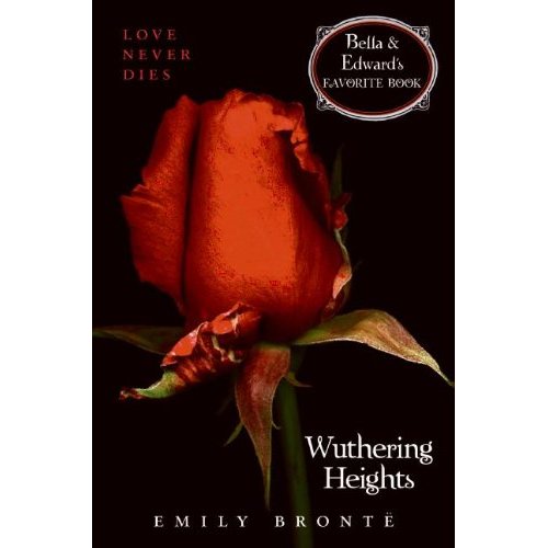
& Juliet is dubbed “The Original Forbidden Love….” This cover of Wuthering Heights, not only proclaims that “Love Never Dies,” but also plainly
states, “Bella & Edward’s Favorite Book.”
Dressing up old favorites in some new garb makes sense from
a marketing standpoint, and while I enjoy the classic covers, I support pretty
much anything that gets people to read more. And if new covers accomplish that
goal, awesome. Plus, some of them are pretty cool looking.
There’s a certain aesthetic appeal to the simplicity of the
images on the black background trend, but I have always preferred covers that
have a bit more to do with the characters. A partiality that has also led to my
biggest book packaging peeve. It drives me absolutely bizonkers when the
physical description of the characters in the book do not match the image of
the characters on the cover. If it is mentioned that a character has black
hair, but on the cover they have light brown. If two characters have a
significant height discrepancy in the story, but are of comparable heights on
the cover. Annoys the bejeepers out of me.
Now it’s pretty much impossible for the person/people on the
front cover to look exactly as I imagine the characters and that’s fine. Just
looking for the specifically mentioned characteristics to be the same. Certain
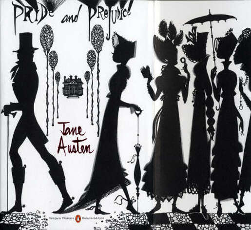
covers avoid this problem all together by favoring silhouettes. My sister
picked up this copy of Pride & Prejudice while waiting in an airport last year. I love it. Main
characters are present and accounted for, as are some of the secondary. All the
detailing fits in with the story and the lack of clear features means I’m never
going to be flipping to the front and thinking, Well, that doesn’t match. Added to all this is the fact even
without seeing facial expression, these characters have personality.
For another beautiful cover utilizing silhouette, check out
Mindee Arnett’s upcoming The Nightmare
Affair. Tor also offers a really cool look
at the process of choosing this particular cover.
So, what about all of you? What books have you judged by
their covers and how has that worked out for you?
No comments:
Post a Comment